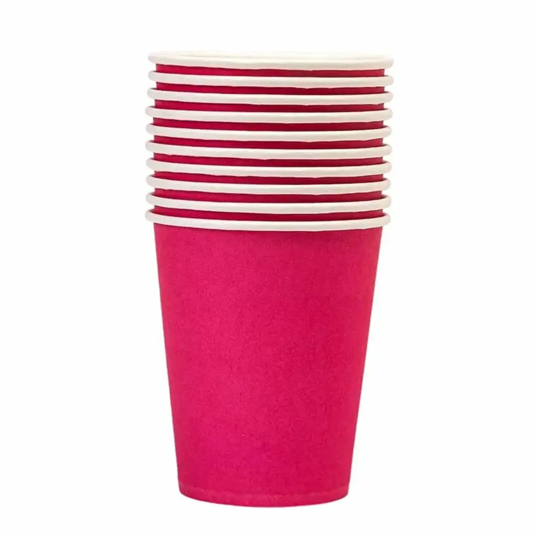
Coloured Paper Cups
Solid colour bodies matched to your brand palette.
Specification & quotePaper Cups — Coloured Paper Cups
A solid colour body is the quickest way to make a cup look deliberate. It reads as a brand decision at ten paces, where a small logo on white does not.
Colour on a cup is printed, not dyed, and that single fact governs how it behaves — coverage, cost and how close a match you can hold.
8 products in this range
Short enquiry
Tell us what you serve and roughly how many you need. We reply with a specification, a minimum quantity and a lead time.
Solid colour bodies matched to your brand palette.
Specification & quote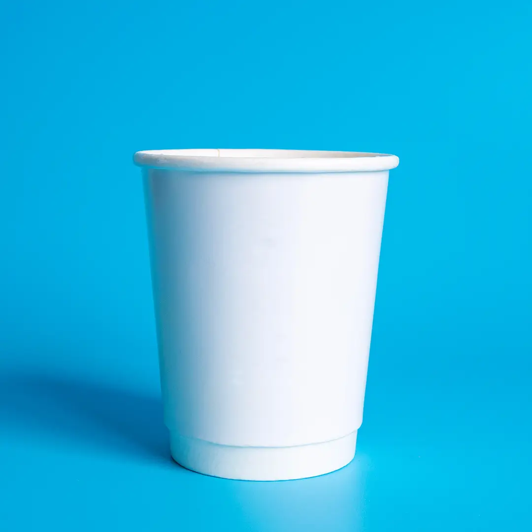
The default base: cheapest to print and the most colour-accurate.
Specification & quote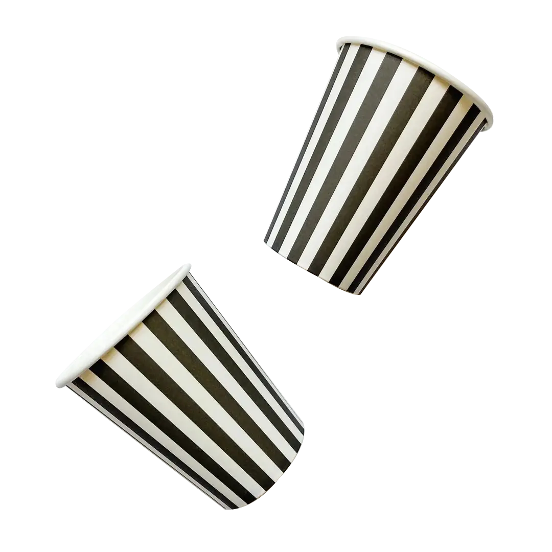
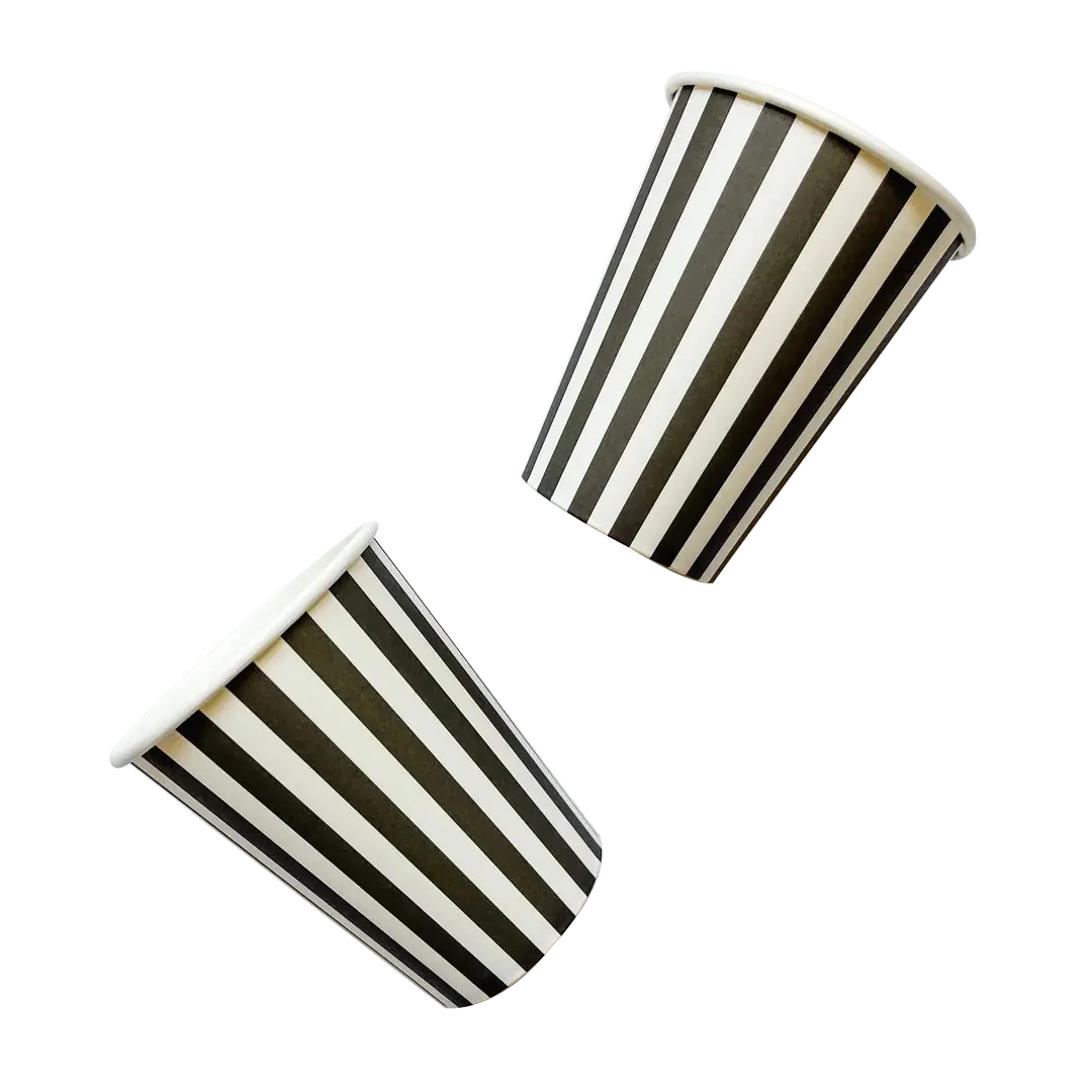
Solid black bodies, usually matt, for a strong counter presence.
Specification & quote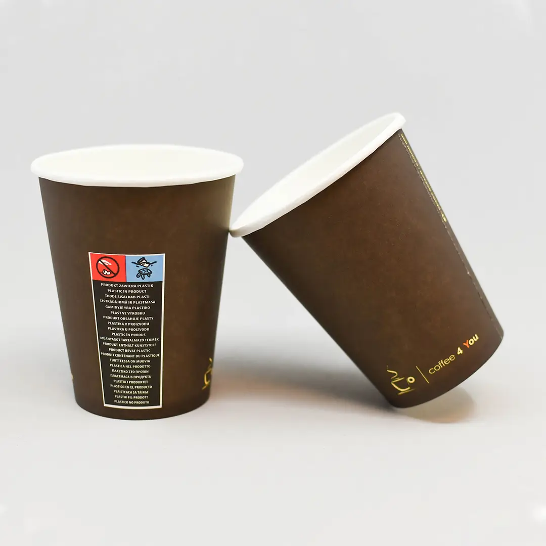
Natural kraft or printed brown — two routes to the same look.
Specification & quote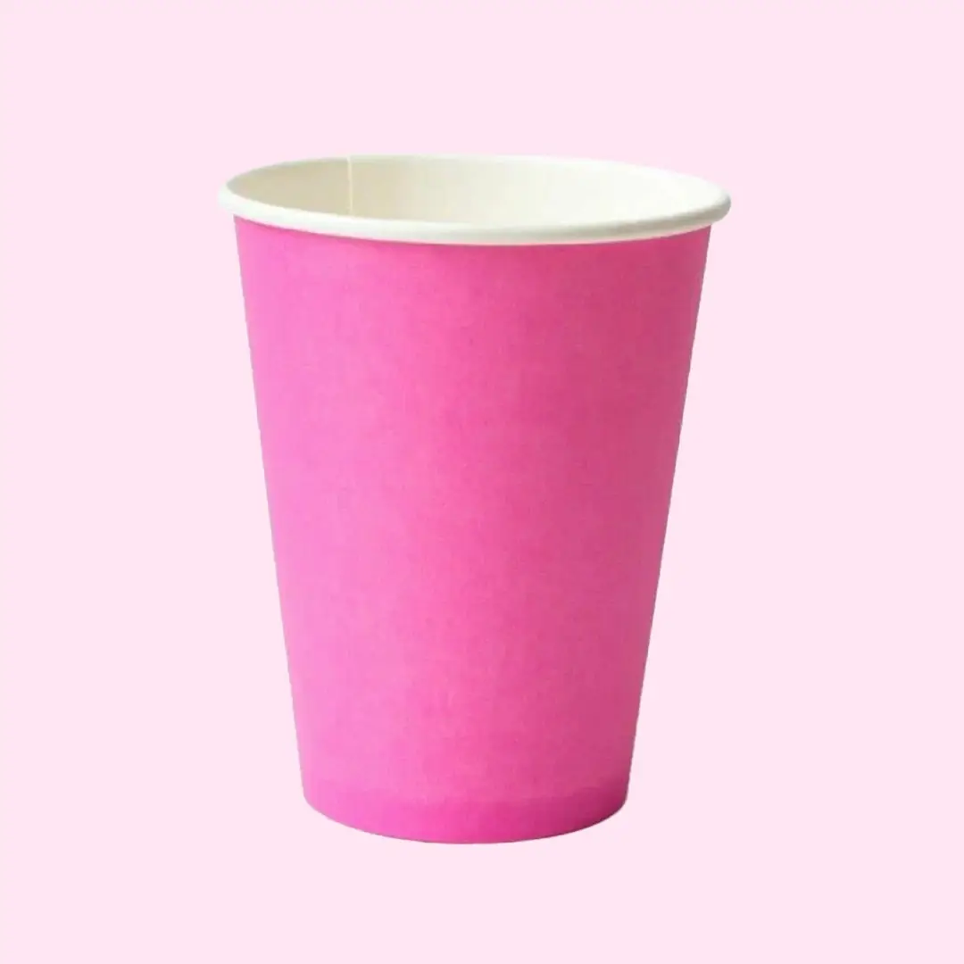
Printed pink bodies for dessert brands, events and campaigns.
Specification & quote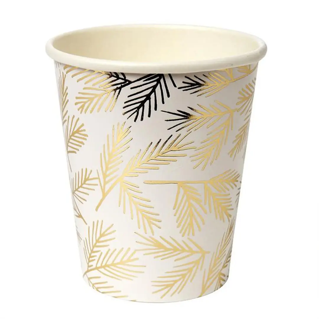
Metallic gold effects for events and festive ranges.
Specification & quote
Bold red bodies for events, venues and festive service.
Specification & quote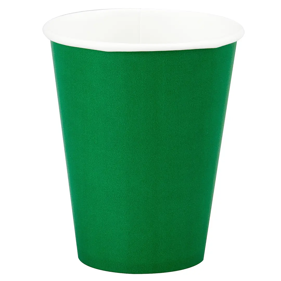
Green bodies for cafés and festive ranges.
Specification & quoteA solid colour across the whole body means ink over the entire printable area, plus a margin at the seam and the rim that stays unprinted so the cup can be formed and rolled.
That unprinted margin is unavoidable. On a dark cup it shows as a thin light line at the rim, which is normal on every printed cup regardless of supplier.
Where an exact match matters more than cost, a spot colour holds far better across a run than the same colour built from CMYK.
The inside face is the food-contact surface and is normally left unprinted. Some specifications allow an inside print with a suitable ink system, which we would confirm rather than assume.
Different sizes can run on different presses or board batches, and a large flat area shows variation that a small logo hides. If colour consistency across sizes matters, say so at quote stage so the sizes can be planned together.
The rim is rolled to form the cup, and printed ink there would crack. Every printed cup carries that margin.
Very close with a spot ink and a Pantone reference. A process build drifts more across a long run.
Because ink covers the whole printable area rather than the small fraction a logo uses. That is the main difference from a white cup.
Normally not. The inner face touches the drink, so any print there needs an ink system specified for direct contact.
Presses and board batches vary between sizes, and a full-coverage colour exposes differences a small mark would conceal.
On digital printing, yes. Send us the split between colours rather than a combined total, since each colour is a separate stock item even when the size and shape are identical.
Pale tints and strong reds. Both benefit from a spot ink rather than a colour built from four process inks.
No. Colour is print on the outside; the lining and wall construction determine how it behaves with a drink.