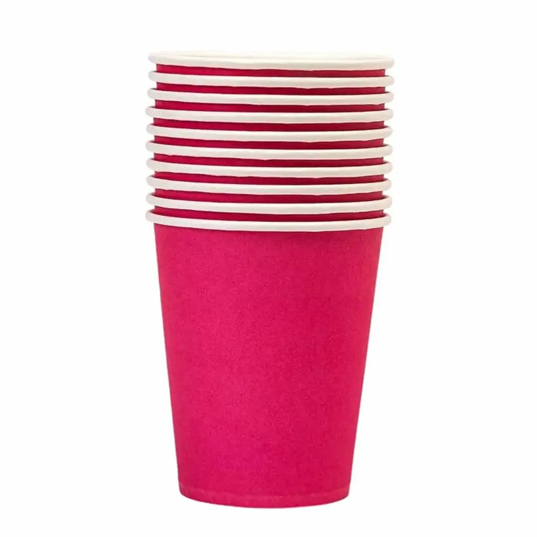
Coloured Paper Cups
Solid colour bodies matched to your brand palette.
Specification & quote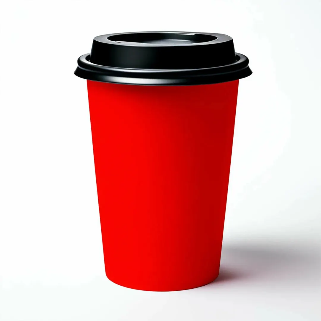
Coloured Paper Cups
Red is the most visible colour at a distance, which is why it dominates event and stadium service. A red cup is identifiable across a crowded room.
It is also a colour that shifts noticeably when built from process inks rather than printed as a spot.
From £0.30 per cupIndicative starting price, excluding VAT and delivery. Your unit cost moves with quantity, board, colour count and finish, and the figure that binds is the one written on your quotation.
Short enquiry
Tell us the quantity and any date you are working to. We reply with the board, print and finish, plus the minimum order quantity and lead time.
Design Your Own
Pick a colour, put your name on it, and see how the idea reads before you ask anyone for a price. It is a sketch rather than a manufacturing proof — the real shape is cut from the product you already serve.
Sleeve colour
Finish
A printed sleeve brands a plain cup you already buy, which is why a single site usually reaches for one before it reaches for a printed cup.
Carry this into the full designerThe full page adds the size, board, print and quantity, then sends the whole specification over in one go. Nothing is committed to at any point.
A red built from CMYK sits close to the edge of what those four inks can produce, so small variations push it towards orange or towards pink.
Across a long run that drift becomes visible when cups from the start and end of the job are held together. A spot red avoids it.
For anything where the red is the brand, specify it as a spot colour rather than a process build.
Festive ranges frequently pair these with green cups often ordered alongside.
Tell us the volume you pour and whether you need matching lids. We reply with a written specification, the minimum order quantity and the lead time for your job.
Cup blanks are a curved fan, so we supply a template to design on. Full file requirements are set out in our artwork guidelines.
Lead times depend on the print method, run length and press schedule, so we confirm yours on the quote rather than publishing a single figure.
Orders are dispatched on national carriers to any UK address. Seedelivery information for how dates are given.
A red built from process inks sits near the limit of what they can reproduce, so it drifts. Specifying a spot red mixed to a Pantone reference holds consistently between runs.
It hides coffee and tea marks well. It shows milk and foam splashes clearly, so it depends which is more likely in your service.
A red built from process inks sits near the limit of what they reproduce, so small variations push it towards orange or pink.
Specify it as a spot colour mixed to a Pantone reference. It holds far better across a run and between reorders.
Coffee and tea marks, yes. Milk and foam splashes show clearly, so it depends which is likelier in your service.
They do, and visibility at a distance is one of the reasons venues use red. It is identifiable across a crowded concourse.
Frequently, alongside green and gold. Festive work concentrates into a few weeks, so order earlier than feels necessary.
Yes, reading as a deeper rust over the warm base. If the red must be exact, that means white board or an underbase.
Per ink, sometimes. On a long run it is often cheaper than a four-ink process build, and it matches better. Ask for both prices.
On digital printing, yes. Send the split between colours so the quantities are priced rather than assumed even.
Sizing questions are usually quicker on the phone, especially if you have the product in front of you.
Solid colour bodies matched to your brand palette.
Specification & quote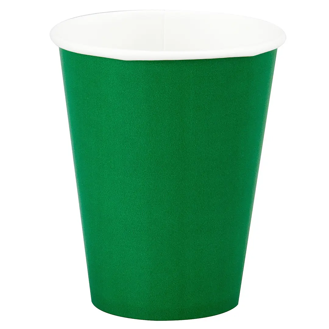
Green bodies for cafés and festive ranges.
Specification & quote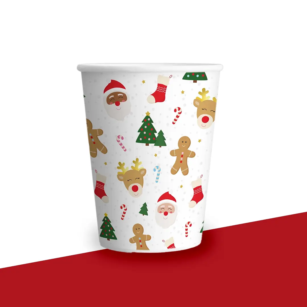
Festive cup designs, planned backwards from the on-counter date.
Specification & quote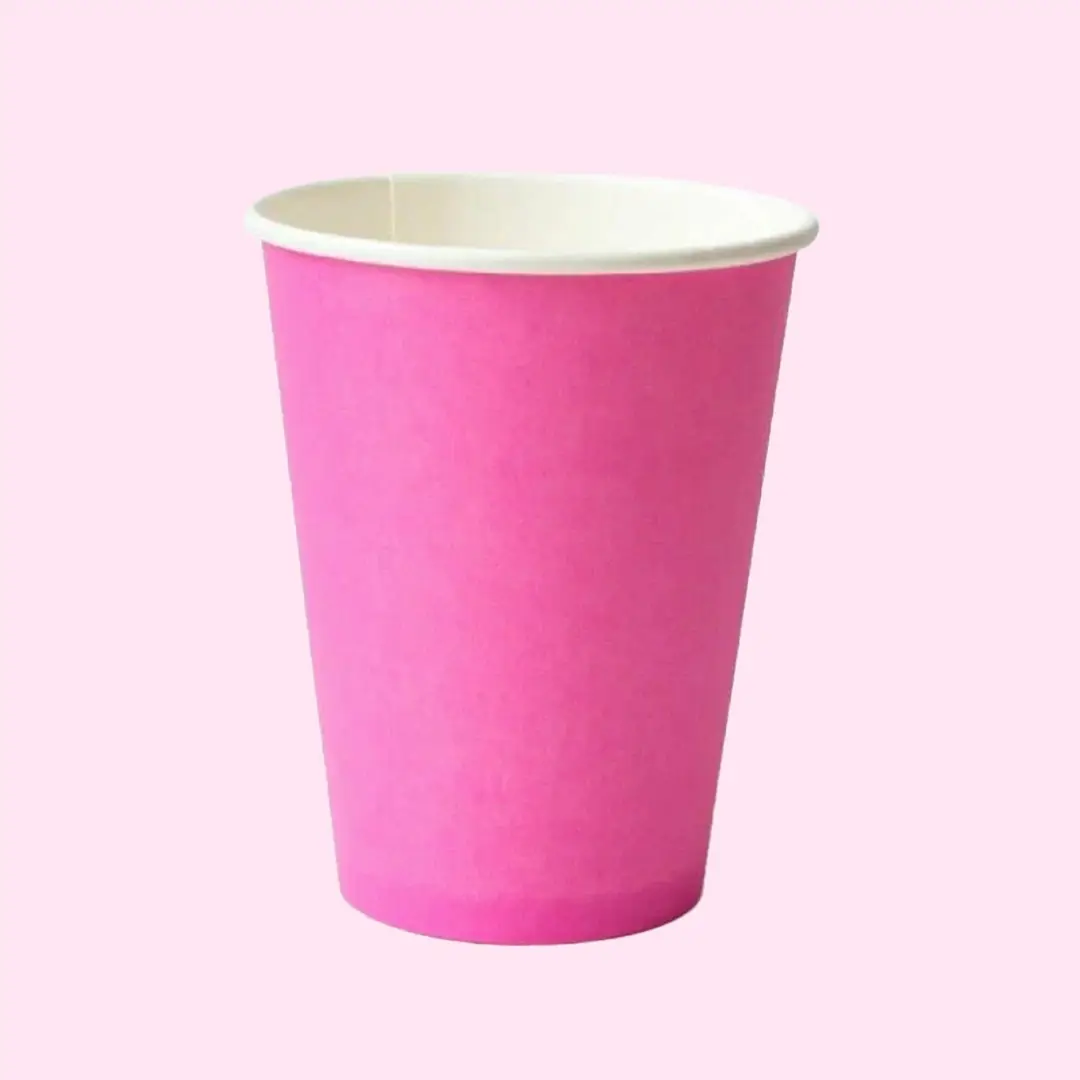
Printed pink bodies for dessert brands, events and campaigns.
Specification & quote