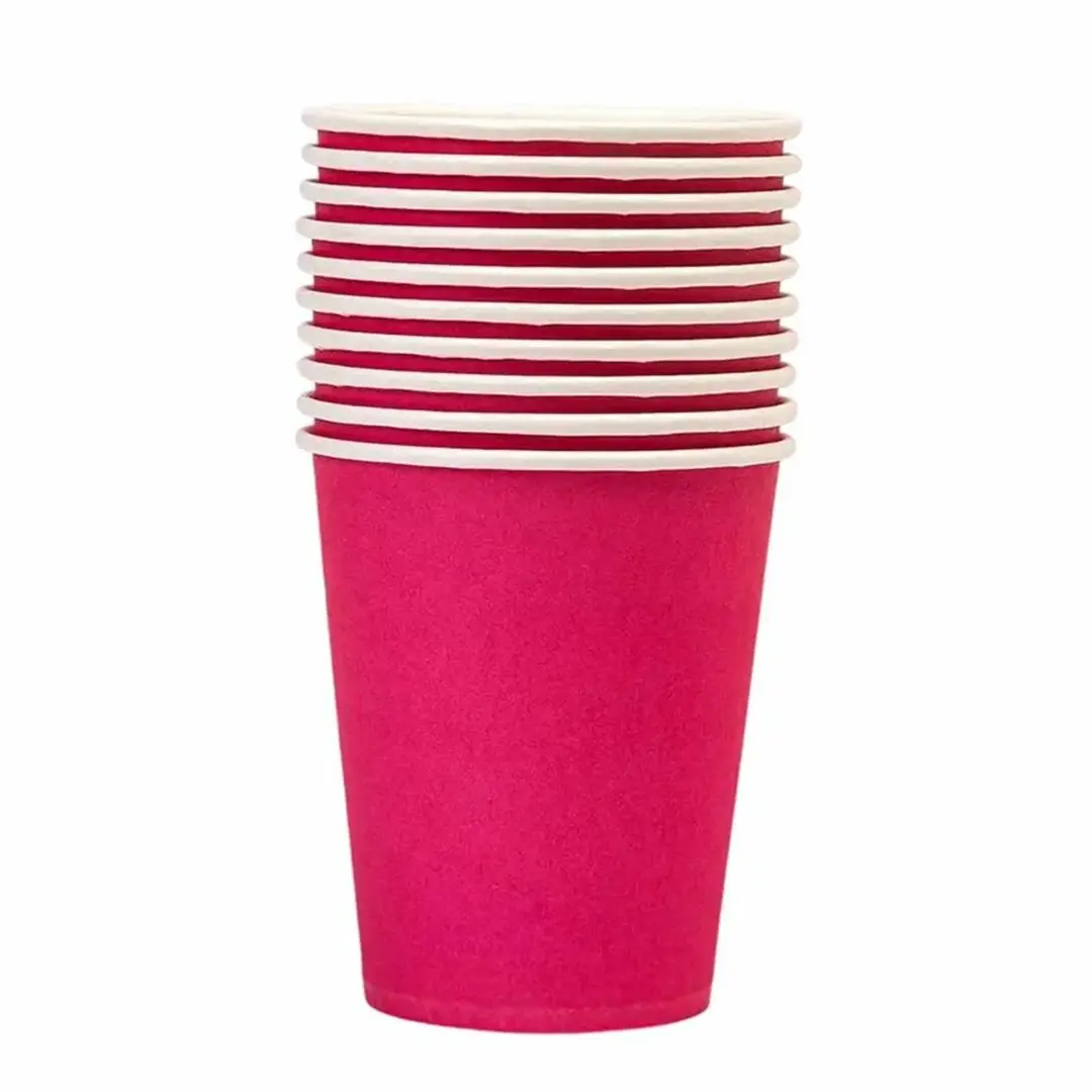
Coloured Paper Cups
Solid colour bodies matched to your brand palette.
Specification & quote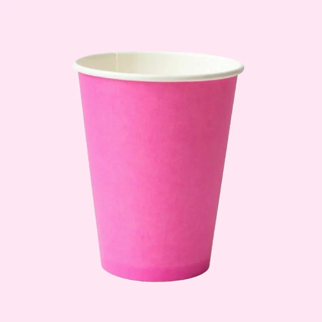
Coloured Paper Cups
Pink is bought by dessert brands, bubble tea shops and campaigns that want to be noticed. It photographs well, which is why it turns up so often on social media.
It is also one of the harder colours to hold evenly, because pale tints show every variation.
From £0.30 per cupIndicative starting price, excluding VAT and delivery. Your unit cost moves with quantity, board, colour count and finish, and the figure that binds is the one written on your quotation.
Short enquiry
Tell us the quantity and any date you are working to. We reply with the board, print and finish, plus the minimum order quantity and lead time.
Design Your Own
Pick a colour, put your name on it, and see how the idea reads before you ask anyone for a price. It is a sketch rather than a manufacturing proof — the real shape is cut from the product you already serve.
Sleeve colour
Finish
A printed sleeve brands a plain cup you already buy, which is why a single site usually reaches for one before it reaches for a printed cup.
Carry this into the full designerThe full page adds the size, board, print and quantity, then sends the whole specification over in one go. Nothing is committed to at any point.
A deep colour hides density variation. A pale pink is a light tint of a stronger ink, and small shifts in how much ink lands read as visible banding or blotchiness.
A spot colour mixed to the shade you want holds far better than a pink built from a light tint of magenta.
The general principles are set out on how solid colour printing works on cups.
Campaign colours are often specified precisely, which is an argument for a spot colour rather than a process build.
Tell us the volume you pour and whether you need matching lids. We reply with a written specification, the minimum order quantity and the lead time for your job.
Cup blanks are a curved fan, so we supply a template to design on. Full file requirements are set out in our artwork guidelines.
Lead times depend on the print method, run length and press schedule, so we confirm yours on the quote rather than publishing a single figure.
Orders are dispatched on national carriers to any UK address. Seedelivery information for how dates are given.
Pale tints show ink density variation that a strong colour would hide. Specifying the pink as a spot colour, mixed to the shade you want, produces a far more even result.
With a Pantone reference and a spot colour, closely. Supply the reference rather than an image, since a pink sampled from a screenshot will not carry the information needed.
Pale tints show ink density variation that a strong colour hides. A spot colour mixed to the shade you want prints far more evenly.
With a Pantone reference and a spot ink, closely. Supply the reference rather than an image sampled from a screen.
Not inherently, but achieving an even pale tint often argues for a spot ink rather than a process build, which can change the price.
Less than white and more than a dark colour. Coffee marks show; milk splashes are less visible than on black.
They are frequently bought for dessert and bubble tea brands, where the cup is part of the visual offer rather than just a container.
Digital printing makes modest runs workable. Send the campaign dates as well as the quantity, since timing affects lead time.
Screens and print differ, and pale colours diverge more than saturated ones. Photograph a printed sample before committing.
Yes, and two spot colours often costs less than full process on a long run while matching more closely.
Sizing questions are usually quicker on the phone, especially if you have the product in front of you.
Solid colour bodies matched to your brand palette.
Specification & quote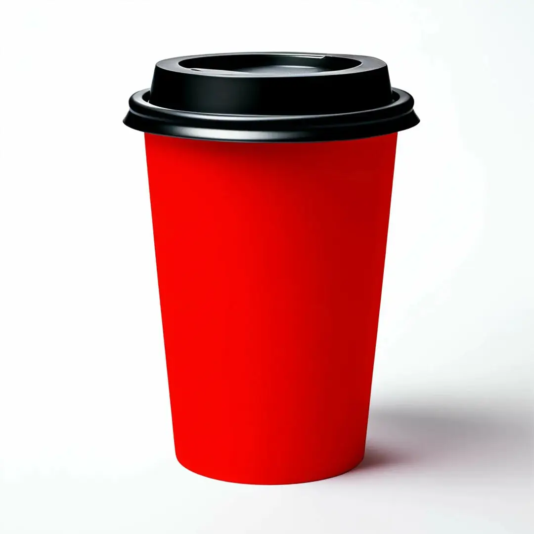
Bold red bodies for events, venues and festive service.
Specification & quote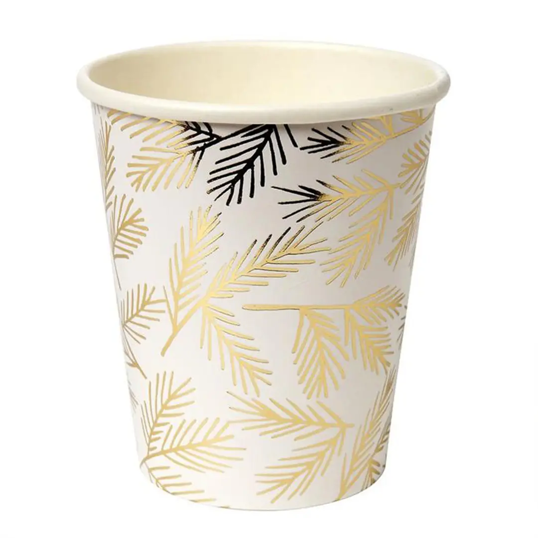
Metallic gold effects for events and festive ranges.
Specification & quote
Full-colour artwork wrapped around the cup body.
Specification & quote