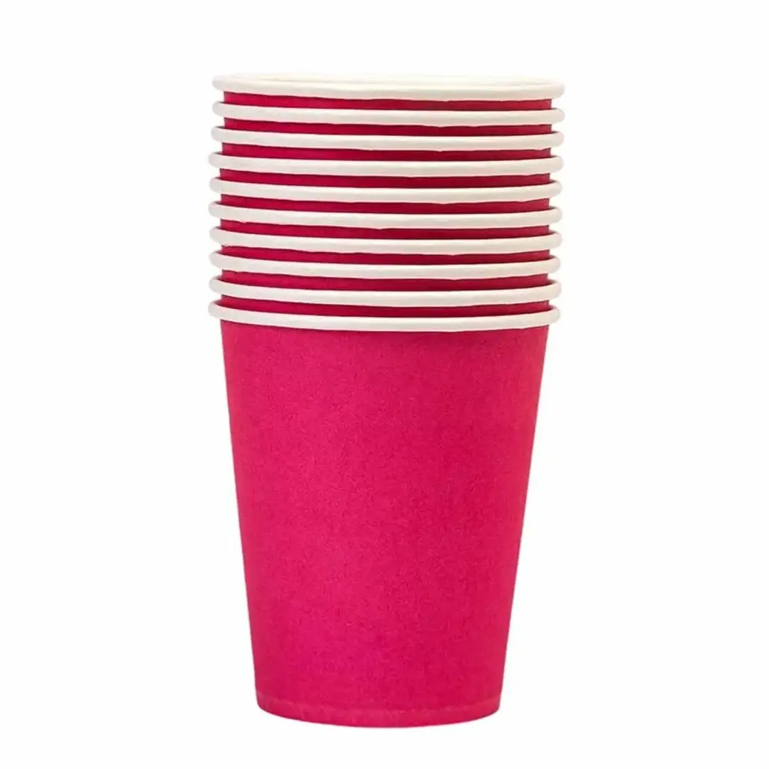
Coloured Paper Cups
Solid colour bodies matched to your brand palette.
Specification & quote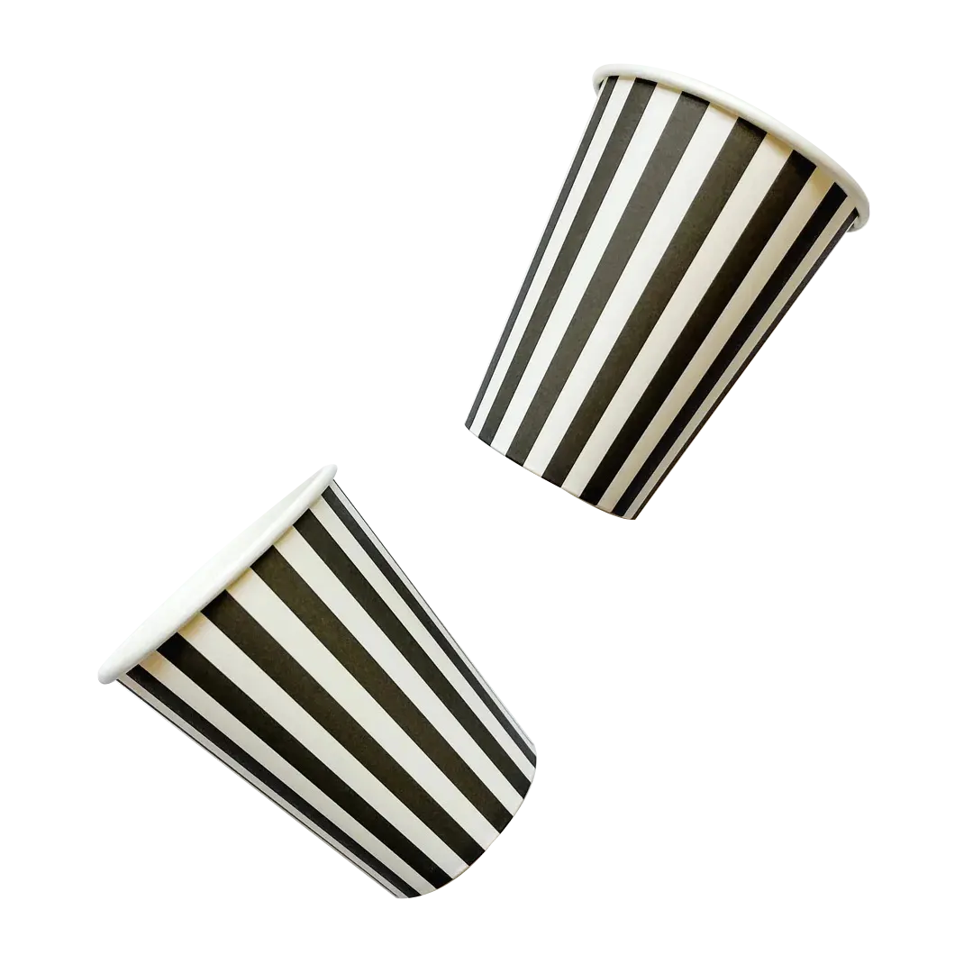
Coloured Paper Cups
Black cups look expensive, which is most of the reason to order them. They also expose every inconsistency in the printing, which is the reason to think about how the black is built.
A single-ink black laid thinly reads brown. A properly built one does not.
From £0.30 per cupIndicative starting price, excluding VAT and delivery. Your unit cost moves with quantity, board, colour count and finish, and the figure that binds is the one written on your quotation.
Short enquiry
Tell us the quantity and any date you are working to. We reply with the board, print and finish, plus the minimum order quantity and lead time.
Design Your Own
Pick a colour, put your name on it, and see how the idea reads before you ask anyone for a price. It is a sketch rather than a manufacturing proof — the real shape is cut from the product you already serve.
Sleeve colour
Finish
A printed sleeve brands a plain cup you already buy, which is why a single site usually reaches for one before it reaches for a printed cup.
Carry this into the full designerThe full page adds the size, board, print and quantity, then sends the whole specification over in one go. Nothing is committed to at any point.
Large flat areas of a single black ink show density variation across a run, and the eye reads that as a warm or patchy cast.
A rich black built from more than one ink, or a spot black, holds far more evenly. It costs a little more and is the difference between a cup that looks premium and one that looks slightly off.
We cover the same problem on cone sleeves in more detail, and the printing principles are identical.
Almost every black cup we quote ends up matt for the first two reasons.
Tell us the volume you pour and whether you need matching lids. We reply with a written specification, the minimum order quantity and the lead time for your job.
Cup blanks are a curved fan, so we supply a template to design on. Full file requirements are set out in our artwork guidelines.
Lead times depend on the print method, run length and press schedule, so we confirm yours on the quote rather than publishing a single figure.
Orders are dispatched on national carriers to any UK address. Seedelivery information for how dates are given.
Almost always a single-ink black laid thinly. Building the black from more than one ink, or using a spot black, gives a deeper and more consistent result across the run.
Yes, because the colour is ink across the whole surface, and a properly built black uses more than one ink to do it. The premium look is what the extra pays for.
A single-ink black laid thinly reads warm. Building it from more than one ink, or using a spot black, gives a deeper and more consistent result.
Matt, almost always. Gloss shows every fingerprint, and a dark cup collects them visibly through a service.
Yes, and it looks striking. Fine lines need slight weight added, because ink spread closes small gaps on board.
More than on a pale cup. Every printed cup leaves a small unprinted margin at the rim, and on solid black it reads as a light line.
Clearly, which is the trade against hiding coffee marks. Which matters more depends on your service.
Spot finishing effects are quoted per job, because availability depends on the print method. Tell us the effect and we will confirm.
A dyed black board behaves differently and is quoted separately. Tell us if the material itself must be black through the section.
Yes, and both can run in one job on digital printing. Tell us the split between them.
Sizing questions are usually quicker on the phone, especially if you have the product in front of you.
Solid colour bodies matched to your brand palette.
Specification & quote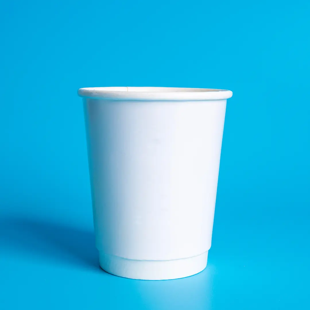
The default base: cheapest to print and the most colour-accurate.
Specification & quote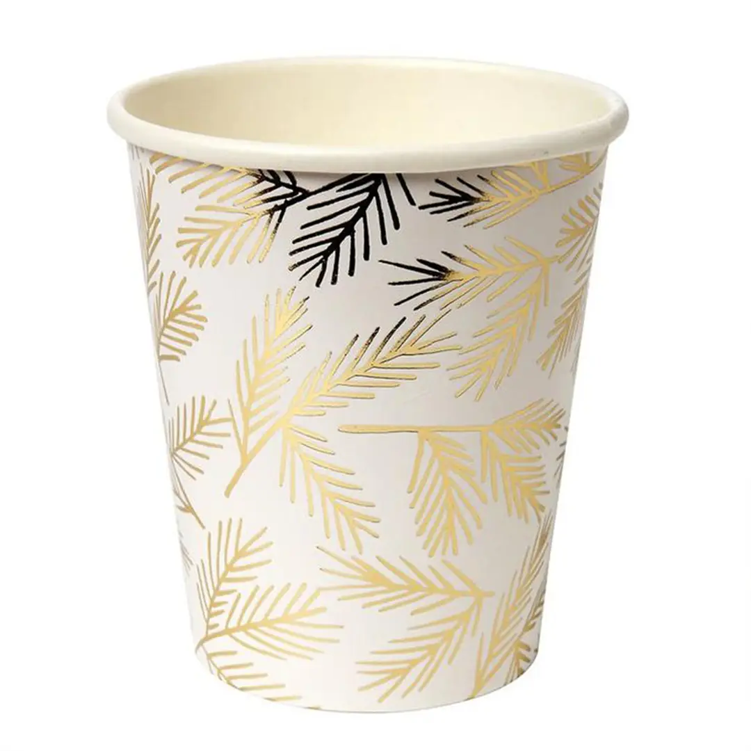
Metallic gold effects for events and festive ranges.
Specification & quote
Solid black wraps with a matt finish for a dark counter look.
Specification & quote