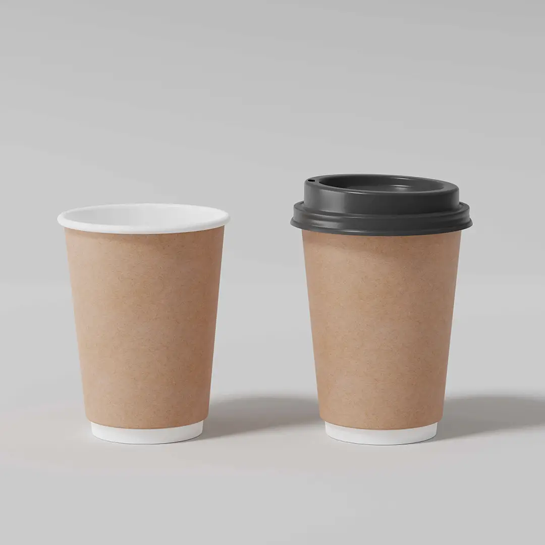
Kraft Coffee Cups
Brown board takeaway cups suited to simple, strong designs.
Specification & quote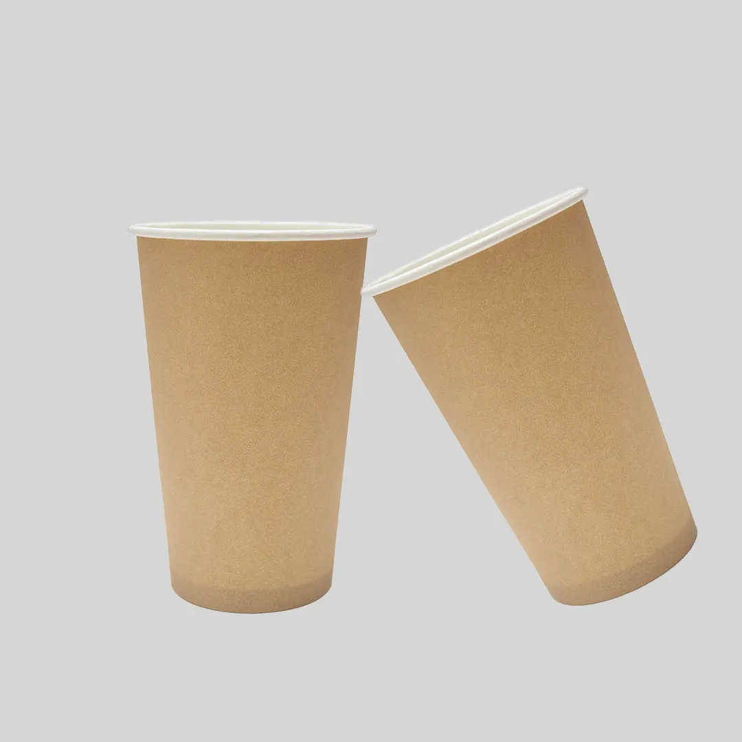
Paper Cup Materials
Kraft board is unbleached, which is the whole reason it is brown and the whole reason independents like it. It reads as plain and considered next to a white cup.
What it does not do is print accurately, and that catches people out after the artwork is signed off.
From £0.30 per cupIndicative starting price, excluding VAT and delivery. Your unit cost moves with quantity, board, colour count and finish, and the figure that binds is the one written on your quotation.
Short enquiry
Tell us the quantity and any date you are working to. We reply with the board, print and finish, plus the minimum order quantity and lead time.
Design Your Own
Pick a colour, put your name on it, and see how the idea reads before you ask anyone for a price. It is a sketch rather than a manufacturing proof — the real shape is cut from the product you already serve.
Sleeve colour
Finish
A printed sleeve brands a plain cup you already buy, which is why a single site usually reaches for one before it reaches for a printed cup.
Carry this into the full designerThe full page adds the size, board, print and quantity, then sends the whole specification over in one go. Nothing is committed to at any point.
Printing inks are transparent. On white board the paper reflects light back through them and colours look as intended; on kraft, that base is warm brown, so everything shifts towards it.
Blues go muddy, pale tints nearly disappear, and a bright red reads as a deeper rust. None of that is a printing fault — it is what the substrate does.
The how the material choices compare across the range page sets out the trade-offs alongside other stocks.
Designs made for kraft usually look better on it than designs adapted to it.
Unbleached board avoids a bleaching stage, but a kraft cup still needs a liquid barrier on the inside and still needs the right collection to be recycled. The brown colour on its own says nothing about disposal.
Tell us the volume you pour and whether you need matching lids. We reply with a written specification, the minimum order quantity and the lead time for your job.
Cup blanks are a curved fan, so we supply a template to design on. Full file requirements are set out in our artwork guidelines.
Lead times depend on the print method, run length and press schedule, so we confirm yours on the quote rather than publishing a single figure.
Orders are dispatched on national carriers to any UK address. Seedelivery information for how dates are given.
It will shift warmer and darker. If the colour is one customers would notice being wrong, either print a white underbase first or choose a white cup — those are the two honest options.
Not inherently. They skip a bleaching stage, but the inside still carries a barrier lining and disposal still depends on local collection. The colour is an appearance choice rather than an environmental one.
Printing inks are transparent. On white board the paper reflects light back through them; on kraft that base is warm brown, so everything pulls towards it.
A white underbase printed first restores accuracy, at the cost of an extra pass. The alternative is designing with the shift rather than against it.
Blues go muddy and pale tints nearly disappear. Black and dark tones print predictably, which is why kraft designs lean on them.
The board is usually similar. Costs differ in the artwork, since a design needing a white underbase adds a printing pass.
Yes. Board alone goes soft against a liquid within minutes, so a kraft cup has the same barrier as a white one on the inside.
Yes, and it stands out well against the brown. It is an extra ink, so price it rather than assuming it is free.
As well as white ones. The board colour has no bearing on heat performance, which comes from the wall construction and lining.
Closely, not exactly. Unbleached board shifts a little between mill batches, which matters if cups sit beside other matched packaging.
Sizing questions are usually quicker on the phone, especially if you have the product in front of you.
Brown board takeaway cups suited to simple, strong designs.
Specification & quote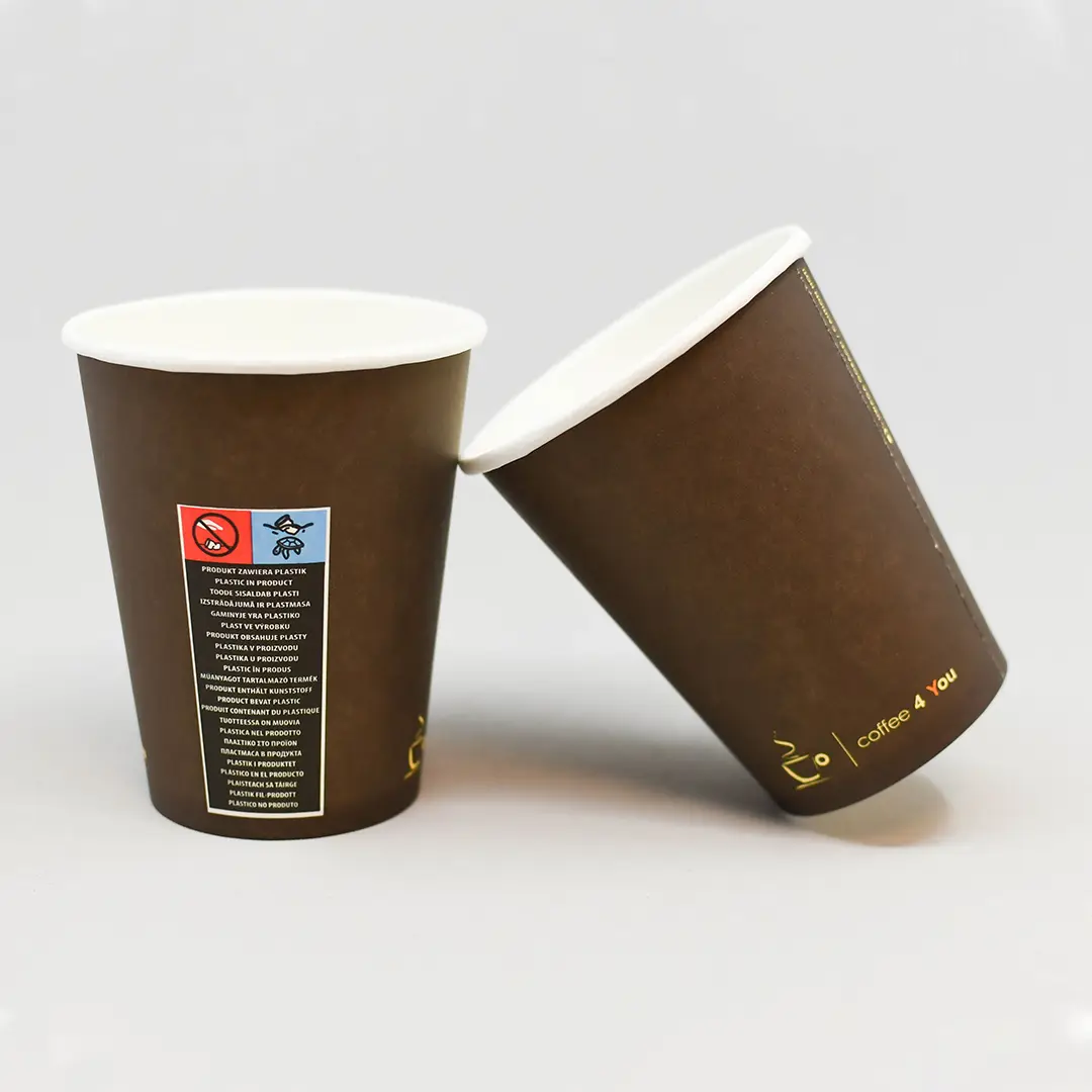
Natural kraft or printed brown — two routes to the same look.
Specification & quote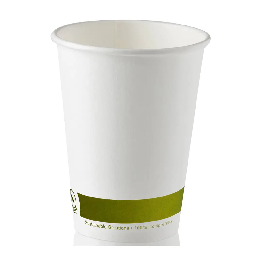
Cups specified for recycling, with realistic guidance on collection.
Specification & quote
Alternative linings and recycled content, with the trade-offs stated.
Specification & quote