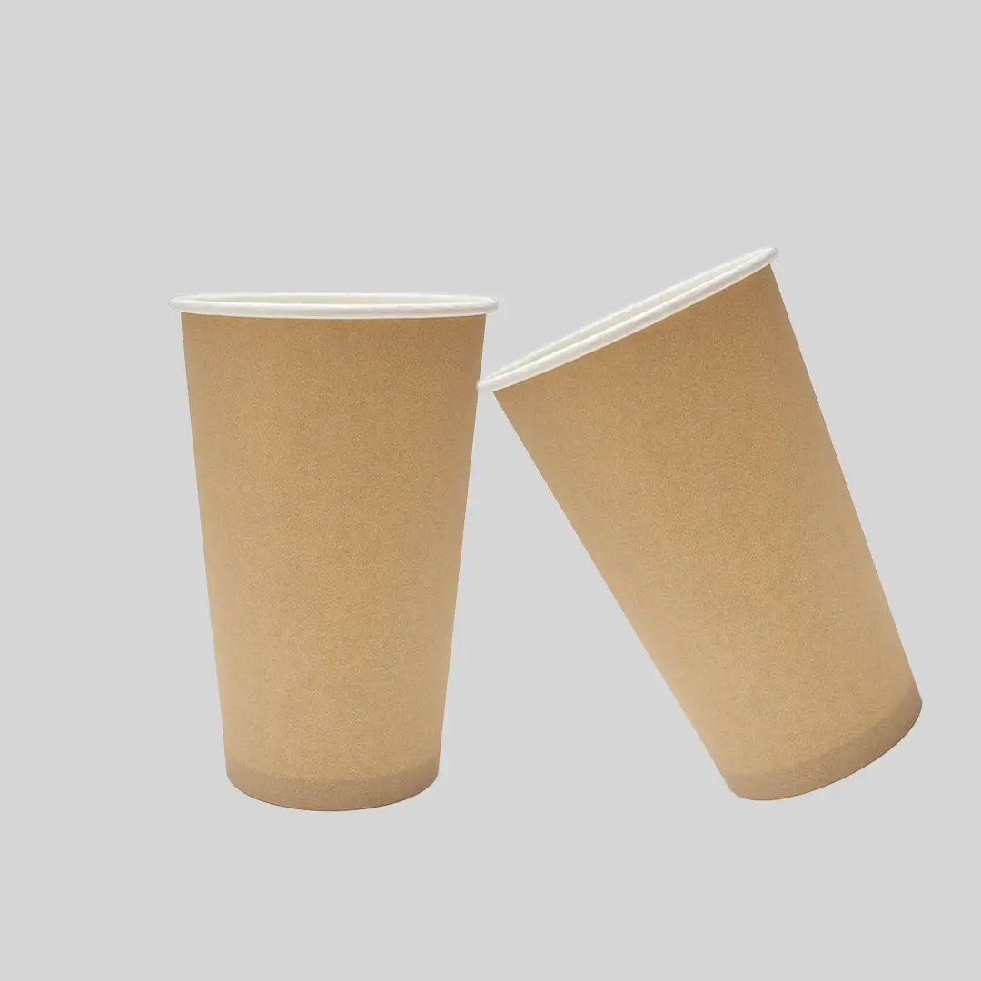
Kraft Paper Cups
Unbleached brown board cups with a plain, unfussy look.
Specification & quote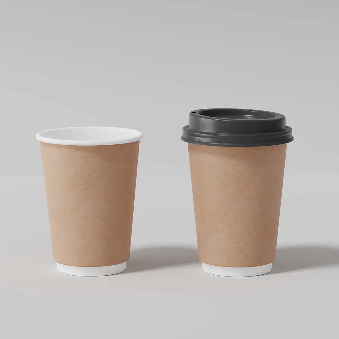
Coffee Cups
Kraft coffee cups are chosen by independents who want their packaging to look unmanufactured. The brown board does a lot of the work before any ink is applied.
Designs that suit it are simple. Designs that fight it are the ones that arrive looking disappointing.
From £0.30 per cupIndicative starting price, excluding VAT and delivery. Your unit cost moves with quantity, board, colour count and finish, and the figure that binds is the one written on your quotation.
Short enquiry
Tell us the quantity and any date you are working to. We reply with the board, print and finish, plus the minimum order quantity and lead time.
Design Your Own
Pick a colour, put your name on it, and see how the idea reads before you ask anyone for a price. It is a sketch rather than a manufacturing proof — the real shape is cut from the product you already serve.
Sleeve colour
Finish
A printed sleeve brands a plain cup you already buy, which is why a single site usually reaches for one before it reaches for a printed cup.
Carry this into the full designerThe full page adds the size, board, print and quantity, then sends the whole specification over in one go. Nothing is committed to at any point.
Photographs and pale gradients are the two things that consistently disappoint on kraft.
The colour-shift detail is covered on how inks behave on unbleached board.
A double-wall kraft cup is a common café specification because the outer wall can be kraft while the inner one is standard, giving the look without changing what touches the drink.
It also removes the need for a sleeve, which matters if you like the plain look but not the extra item.
Tell us the volume you pour and whether you need matching lids. We reply with a written specification, the minimum order quantity and the lead time for your job.
Cup blanks are a curved fan, so we supply a template to design on. Full file requirements are set out in our artwork guidelines.
Lead times depend on the print method, run length and press schedule, so we confirm yours on the quote rather than publishing a single figure.
Orders are dispatched on national carriers to any UK address. Seedelivery information for how dates are given.
You can, but it will read darker and warmer than intended. If the colours are critical, a white underbase restores accuracy at extra cost, or a white cup avoids the issue entirely.
The board is usually similar. Where costs differ is in the artwork — a design needing a white underbase to sit correctly on kraft adds a printing pass.
A single dark colour, line illustration, or type reversed to the board colour. Photographs and pale gradients consistently disappoint.
Yes, and it reads brightly against the brown. It is an extra ink, so price it rather than assuming it is included.
Commonly, with a kraft outer and a standard inner. That gives the look without changing what touches the drink.
On a single wall with a hot drink, yes, above about 8oz. A double-wall kraft cup removes that need.
A little, because unbleached board shifts between mill batches. It matters if cups sit beside other matched packaging.
It skips a bleaching stage, which is real. It does not change the lining inside or how the cup is collected.
Yes. Two well-chosen inks usually look better on kraft than four fighting the brown base, because every colour printed on unbleached board shifts warmer than it would on white.
The board is usually similar to white. Cost differs where artwork needs a white underbase to sit correctly.
Sizing questions are usually quicker on the phone, especially if you have the product in front of you.
Unbleached brown board cups with a plain, unfussy look.
Specification & quote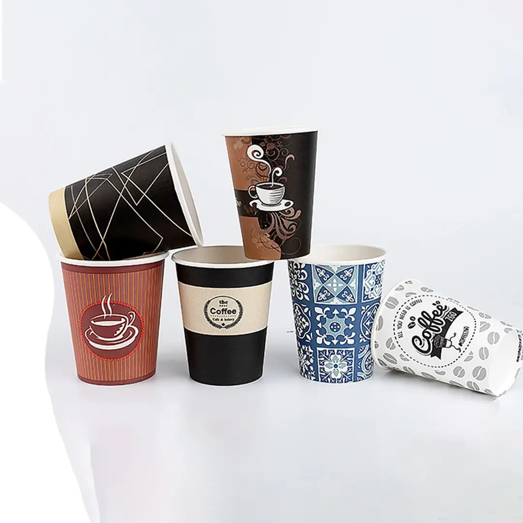
Branded takeaway cups, designed around how they are held.
Specification & quote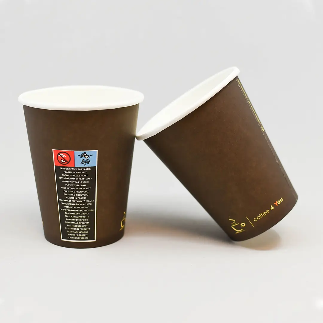
Natural kraft or printed brown — two routes to the same look.
Specification & quote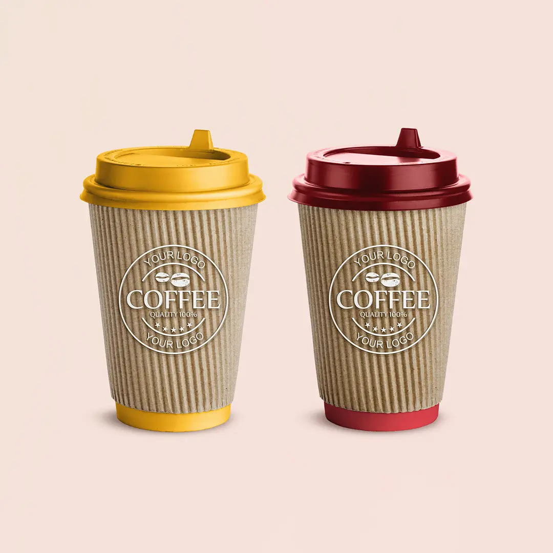
Heavier board hot cups with a rim that seats a lid properly.
Specification & quote