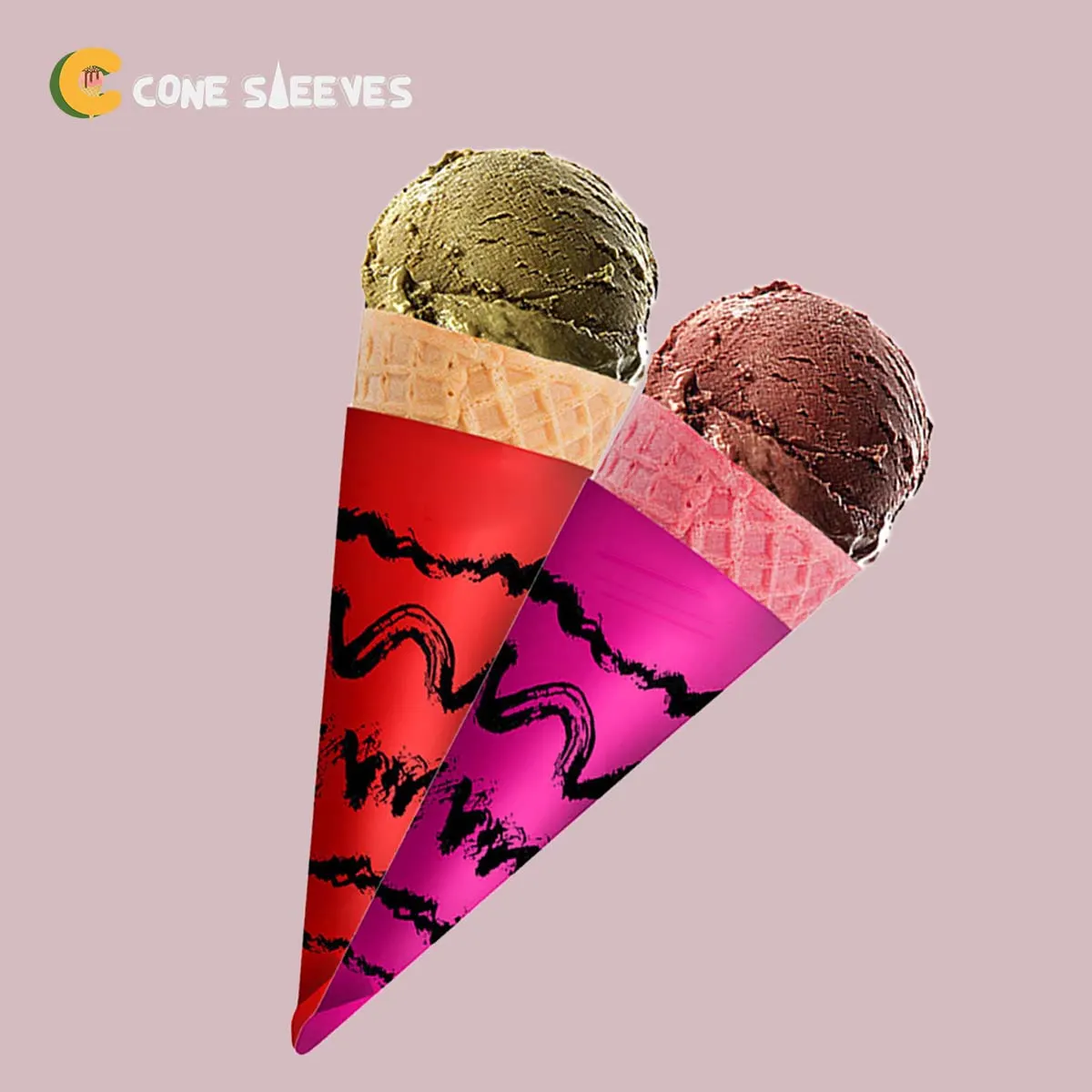
The Shape You Are Designing On
Take a cone sleeve and unroll it. What you have is not a rectangle and not a trapezium — it is a section of a ring, curved along both the top and bottom edges, wider at one end than the other.
Every consequence in this article follows from that shape. A designer given a rectangle and told to make it fit will produce artwork that distorts in ways nobody can quite explain until the first box arrives.
The fix is simple: get the die line before you start, and build on it.
What Happens to Artwork Built on a Rectangle
These are the failures we see most often, and all of them are geometry rather than printing:
- Horizontal type set level on the flat rises at both ends once the sleeve is wrapped.
- A straight band across the middle becomes a visible curve.
- A logo centred on the flat sits off-centre on the assembled cone, because the overlap eats one side.
- Elements near the narrow end shrink to nothing, since that end has very little width.
- Full-bleed colour shows a white sliver at the cut, because the artwork stopped at the die line instead of past it.
None of these can be corrected after printing. All of them cost nothing to avoid if the template arrives first.
Setting Type on an Arc
Type that should read horizontally on the finished cone has to be set on a curve on the flat, following the same radius as the die.
Every serious design application can do this — it is the same control used for text on a circular badge. What it needs is the correct radius, which comes from the die line rather than from guesswork.
A short wordmark tolerates this better than a long sentence. If you have a lot to say, consider saying less rather than setting a paragraph on a curve.
For anything non-standard, how a die line is produced for a bespoke shape covers the die stage that comes first.
A Working Sequence for a Cone Sleeve Design
Following this order removes almost all rework.
Get the Die Line Before Designing Anything
Ask us for it at enquiry stage. It shows the cut, the fold, the overlap area and the safe margin, as editable vector layers.
Place the Fixed Elements First
The wordmark and anything legally or commercially essential. Keep them out of the overlap and away from the narrow end.
Build the Background to Bleed
Extend any full-coverage colour or image past the cut line, so the die never exposes unprinted board.
Set Curved Type Last
Once the layout is settled, set anything that needs to read horizontally on the cone along the die's arc.
Check at Actual Size, Printed
Print the flat at 100 per cent on a desktop printer, cut it out and wrap it round a real cone. This catches more than any on-screen check.
File Requirements
What we need in order to print without going back and forth.
| Format | Vector PDF or AI preferred; high-resolution PSD or TIFF accepted |
|---|---|
| Resolution | At least 300 dpi at final size for any raster element |
| Colour space | CMYK for process work; named Pantone references for spot colours |
| Bleed | Artwork extended past the cut line on every edge |
| Fonts | Converted to outlines, or supplied with the file |
| Layers | Die line kept on its own layer and not flattened into the artwork |
| Black | Rich black built from more than one ink for large solid areas |
Send the working file rather than a flattened export where possible. It makes small adjustments quick instead of impossible.
Colour: What a Screen Cannot Tell You
Screens emit light; printed board reflects it. A colour will always look more muted on paper than it does backlit, and no amount of screen calibration changes that.
On kraft or uncoated board the shift is larger again, because the ink sits over a warm base rather than a white one.
If a colour is one your customers would notice being wrong, specify it as a named Pantone rather than a CMYK build, and ask what sample options exist for your print method.
The kraft case is set out with examples on how much colour shifts on unbleached board.
The Safe Area, and Why It Is Bigger than You Think
The overlap where the sleeve glues or tucks is hidden on every assembled unit. Anything placed there is invisible for the life of the product.
On top of that, cutting has a small tolerance, so elements sitting right against the cut line risk being trimmed on some units and not others.
The safe area on the die line accounts for both. Treat it as a hard boundary for anything that matters, and use the space outside it only for background that can survive being trimmed.
One Test Worth Doing Before You Approve
Print the flat artwork at full size, cut around the die line with scissors, and wrap it around one of your actual cones with a piece of tape.
It takes five minutes and it answers questions no proof can: whether the logo faces the customer, whether the type reads level, whether the wrap stops where you wanted, and whether anything important disappears into the overlap.
Every problem found at that stage is free to fix. The same problem found after a run has printed is not.
Questions
Can you supply the die template to our designer directly?
Yes, and it is worth asking for it before design work starts rather than after. We send it as an editable vector file with the cut, fold, overlap and safe area on separate layers.
What if we only have a logo and no design?
That is a perfectly workable starting point. A single mark repeated around the sleeve on a plain board is one of the cheapest and most effective specifications there is, and it needs no illustration work.
Do you check artwork before printing?
We check position, bleed, resolution and that everything important sits inside the safe area, and we issue a digital proof on the die line. Colour accuracy on screen is the one thing a proof cannot confirm.
Can you fix artwork built on a rectangle?
Sometimes, by rebuilding it on the die line, which is design work rather than an adjustment. Getting the template first avoids it.
What if we have no designer?
Send what you have. A logo on a plain board is a legitimate specification and needs no illustration work at all.
Should fonts be outlined?
Yes, or supply the font files with the artwork. An outlined font cannot substitute itself for something else on another machine, which is exactly what causes unexplained layout changes.
How much bleed do you need?
Artwork extended past the cut line on every edge. The exact amount is marked on the die template we send.
Can we supply a PDF from a design app?
A vector PDF is fine. A flattened export limits what can be adjusted, so send the working file alongside it where you can, since small changes then take minutes rather than being impossible.
What is the single most useful thing we can do?
Print the flat at full size, cut it out and wrap it around a real cone. Five minutes there catches more than any screen check.
Can we send artwork before we have a quote?
Yes, and it often helps. We will tell you what will and will not hold at print size before you commit to anything.