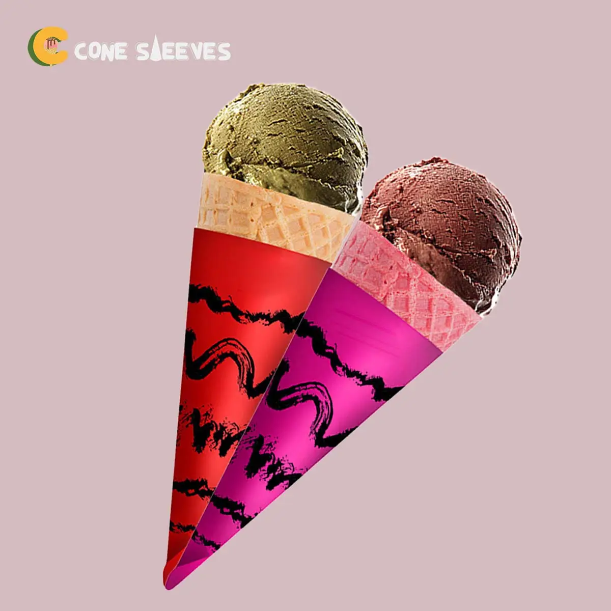
Abstract Design Ice Cream Cone Sleeves
Illustrated and abstract artwork laid out for the cone shape.
Specification & quote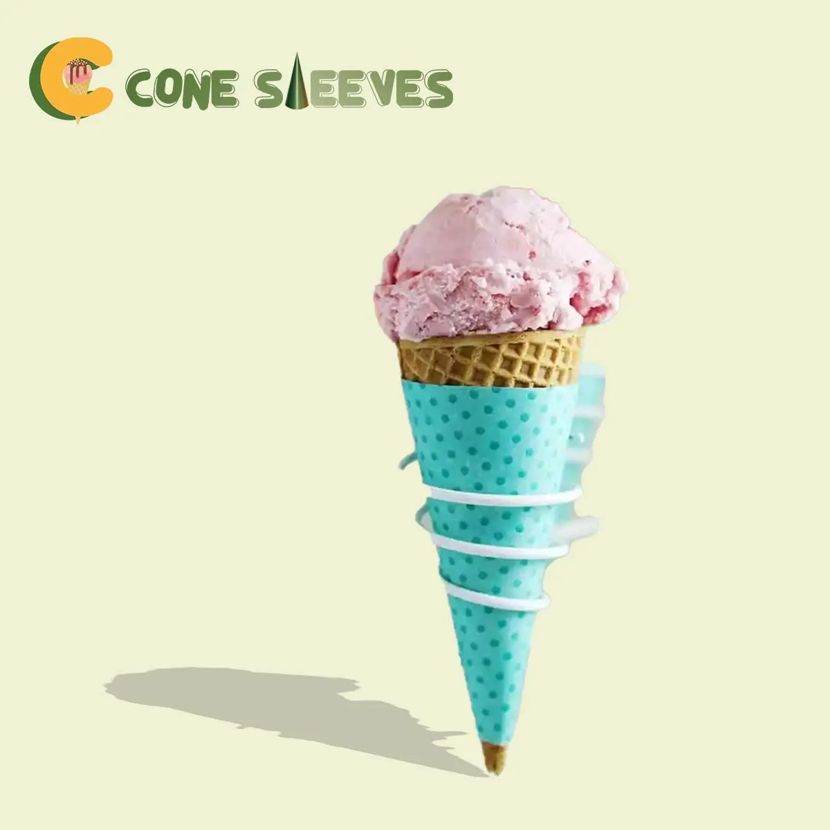
Cone Sleeves
A repeating pattern solves a problem single logos have on cones: whichever way the customer holds it, the design looks intentional. There is no wrong side.
Dots are the most forgiving pattern to print on a curved, tapered surface, which is why they have stayed popular on ice cream packaging for decades.
From £0.30 per sleeveIndicative starting price, excluding VAT and delivery. Your unit cost moves with quantity, board, colour count and finish, and the figure that binds is the one written on your quotation.
Short enquiry
Tell us the quantity and any date you are working to. We reply with the board, print and finish, plus the minimum order quantity and lead time.
Design Your Own
Pick a colour, put your name on it, and see how the idea reads before you ask anyone for a price. It is a sketch rather than a manufacturing proof — the real shape is cut from the product you already serve.
Sleeve colour
Finish
Leave two or three centimetres of wafer showing. Customers read a visible cone as freshly made, and the sleeve still catches the first drips.
Carry this into the full designerThe full page adds the size, board, print and quantity, then sends the whole specification over in one go. Nothing is committed to at any point.
A cone sleeve is a tapered band. A logo placed once sits in a different position on every assembled sleeve and faces away from the viewer half the time.
A pattern covers the whole surface evenly, so the sleeve reads the same from any angle. The brand mark can then sit once, small, in a fixed position on the pattern.
This is a good candidate for two-colour printing, since a pattern rarely needs photographic reproduction.
Patterns like these are exactly what two-colour spot printing for flat pattern work is suited to.
A busy surface disguises the scuffs and fingerprints that show clearly on a flat solid colour. On sites that assemble sleeves in advance and stack them, this is a practical advantage as much as a design one.
Send us two or three of the cones you use, or the top diameter and slant height. We reply with a written specification, the minimum order quantity and the lead time for your job.
We supply a die template cut to your cone before design work starts. Full file requirements are set out in our artwork guidelines.
Lead times depend on the print method, run length and press schedule, so we confirm yours on the quote rather than publishing a single figure.
Orders are dispatched on national carriers to any UK address. Seedelivery information for how dates are given.
Yes. The same reasoning applies to stripes, checks or any repeating motif. Dots simply tolerate the taper distortion better than a strict grid does.
Not necessarily. Cost follows the number of inks rather than how much of the surface they cover, so a one-colour pattern prices much like a one-colour logo.
Yes, and it changes the character considerably. Larger, sparser dots read as playful; small, dense ones read closer to a texture. We can show both on the die template.
They compress slightly towards the narrow end, which is the taper doing its work. Dots absorb that far better than a strict grid, which is why the pattern has lasted.
Not usually. Price follows the number of inks rather than the area they cover, so a one-colour pattern prices much like a one-colour mark.
In a deliberately clear area of the pattern rather than on top of it. Leaving that gap in the artwork looks intentional; dropping a logo onto a busy field does not.
Yes, and two sizes of dot in one colour is another way to add depth without a second ink. Both are worth pricing before deciding.
Noticeably. A busy surface disguises the scuffs and fingerprints that show clearly on a flat solid colour, which helps on sites that pre-assemble and stack sleeves.
Easily, because the die stays the same. Only the print changes, so a seasonal version is a shorter job than the original order was.
Very small dots can close up or drop out on board. Send the artwork and we will tell you what will hold before the run rather than after it.
Sizing questions are usually quicker on the phone, especially if you have the product in front of you.
Illustrated and abstract artwork laid out for the cone shape.
Specification & quote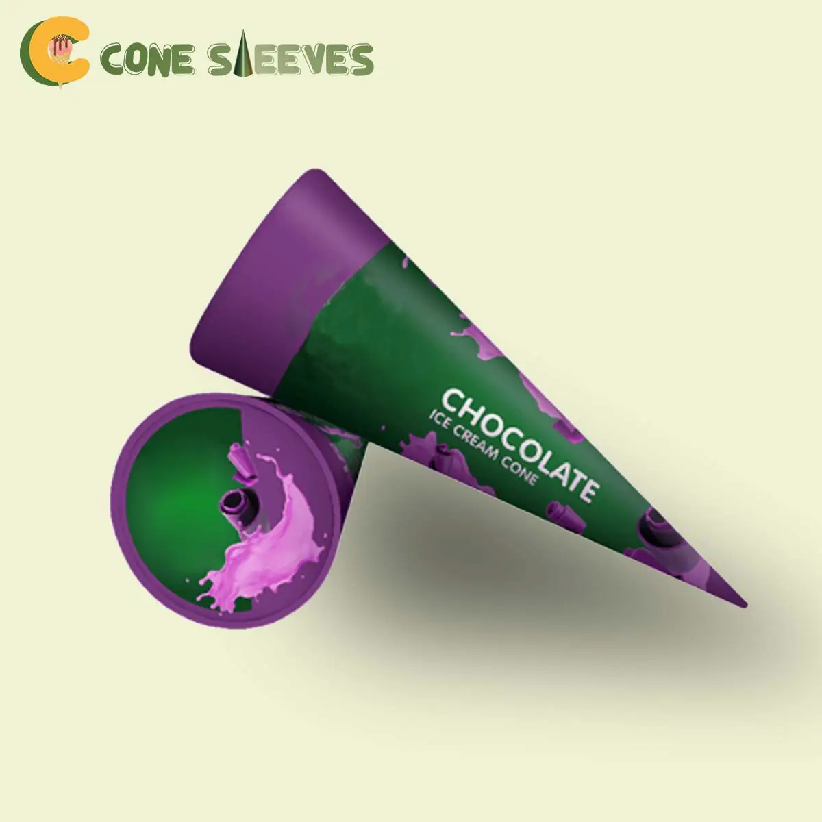
Spot-colour printing in two inks, for accurate brand colour at lower cost.
Specification & quote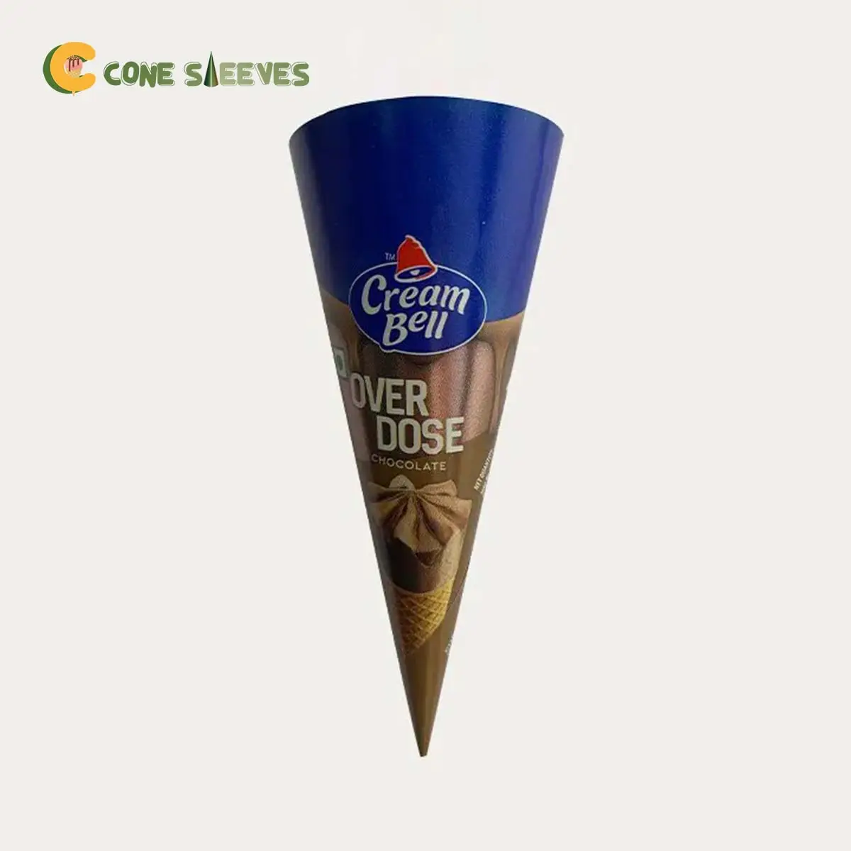
Full-colour printed sleeves cut to the cone you already serve.
Specification & quote
Clean white wraps, plain or printed with a simple logo.
Specification & quote